Hey again! This time round I will show you what I created mainly using only the July's add-on kit called "Knickers". I have created 2 layouts : the clean and the messy look. Let's move on...
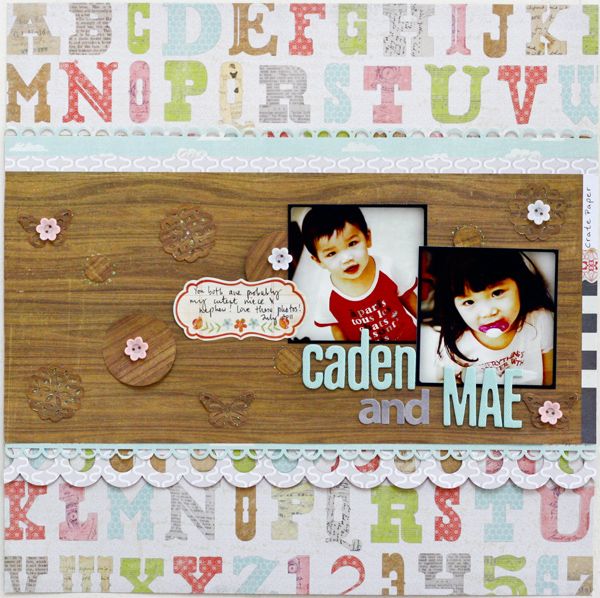
Here is my version of clean. The papers and the embellies are carefully chosen & structured to achieve such look. I also kept this layout minimal because of the busy background :)
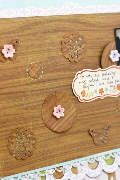
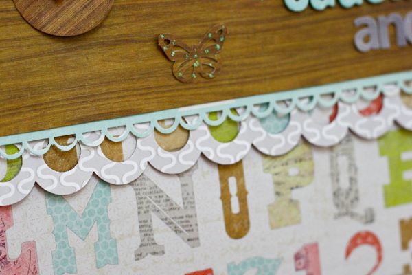
Close-up shots:
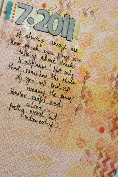
Now, I present to you the messy look. I played with ink, mist and medium too. Inside this awesome add-on kit, there is this yummy stamp named Chevron Background. Totally reminded me of the tire trails. BTW, are you aware that the kit stamps are now collaborated with Hero Arts? If you have no idea, now you got the news :)
Close-up shots:
Each month, there are at least 4 add-on kits for you to choose and they are priced reasonably too. You can click HERE for more info. So wait no more, go grab your fav now!
Have a good Sunday!
Xoxo Jessy


3 comments:
Lovely LOs .. esp the first one... I love the wood pp, with all the subtle elements.. gorgeous :D
Hey beb, u rock the kit!!! Love both but i heart the messy look the most!!! Tfs such a wonderful layouts! :)))
Wowwee, I heart both of them!! If I have to choose one, I'll pick no2 LO. Both of the layouts are so different in style. I love the fact on how you turn SC kit to be so versatile :)
Post a Comment